During my three years at SentinelOne, I worked as part of the UX team designing core experiences within the Singularity Platform, an AI-driven cybersecurity solution used by enterprise security teams.
My work focused on simplifying highly technical workflows, improving threat-investigation clarity, shaping data-rich dashboards, and helping build a cohesive design system that could scale across new modules as the company grew.

Product Overview
About
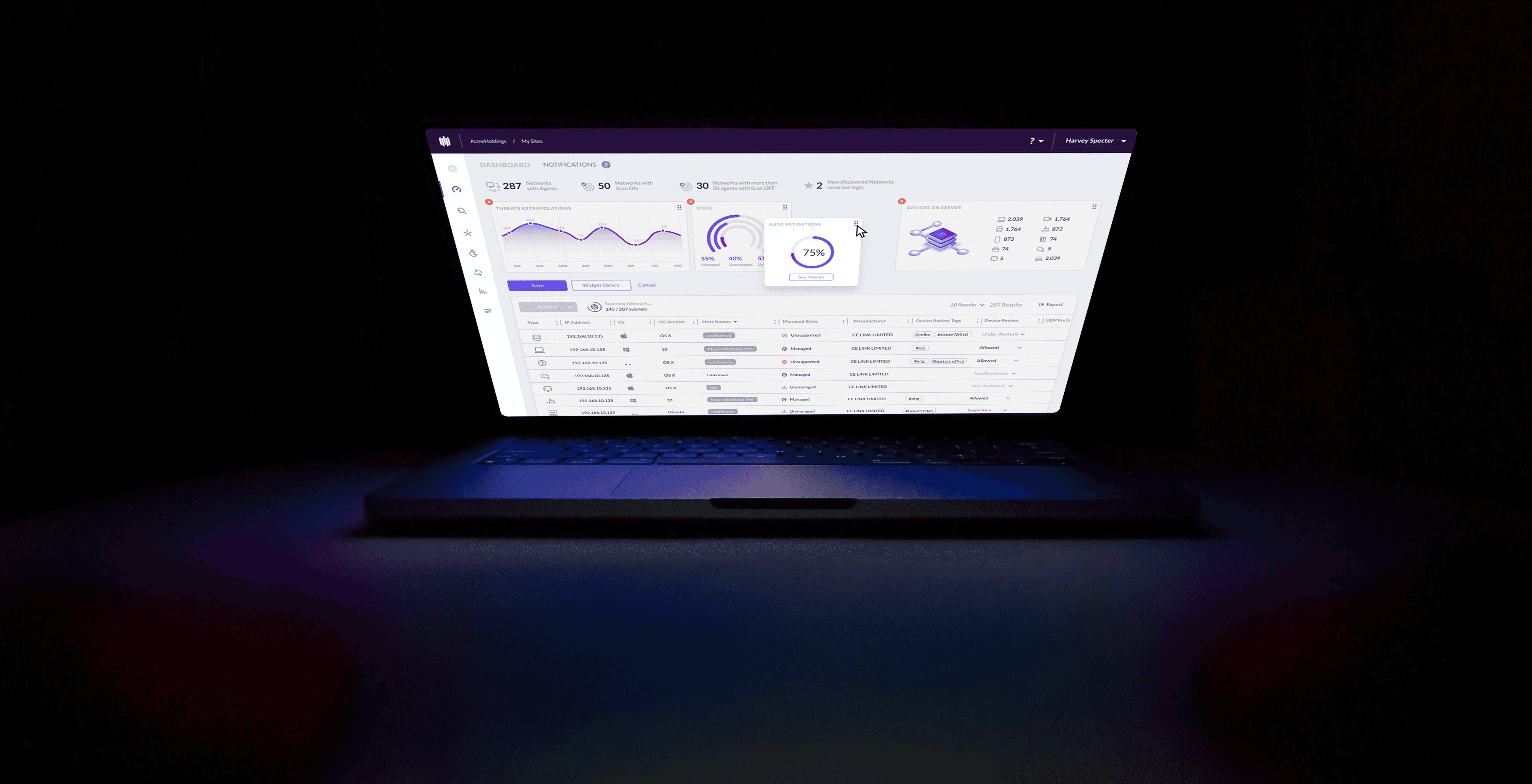
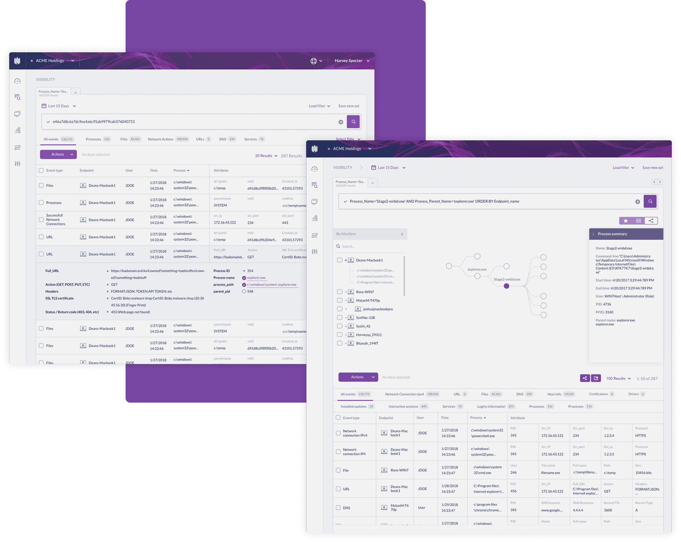
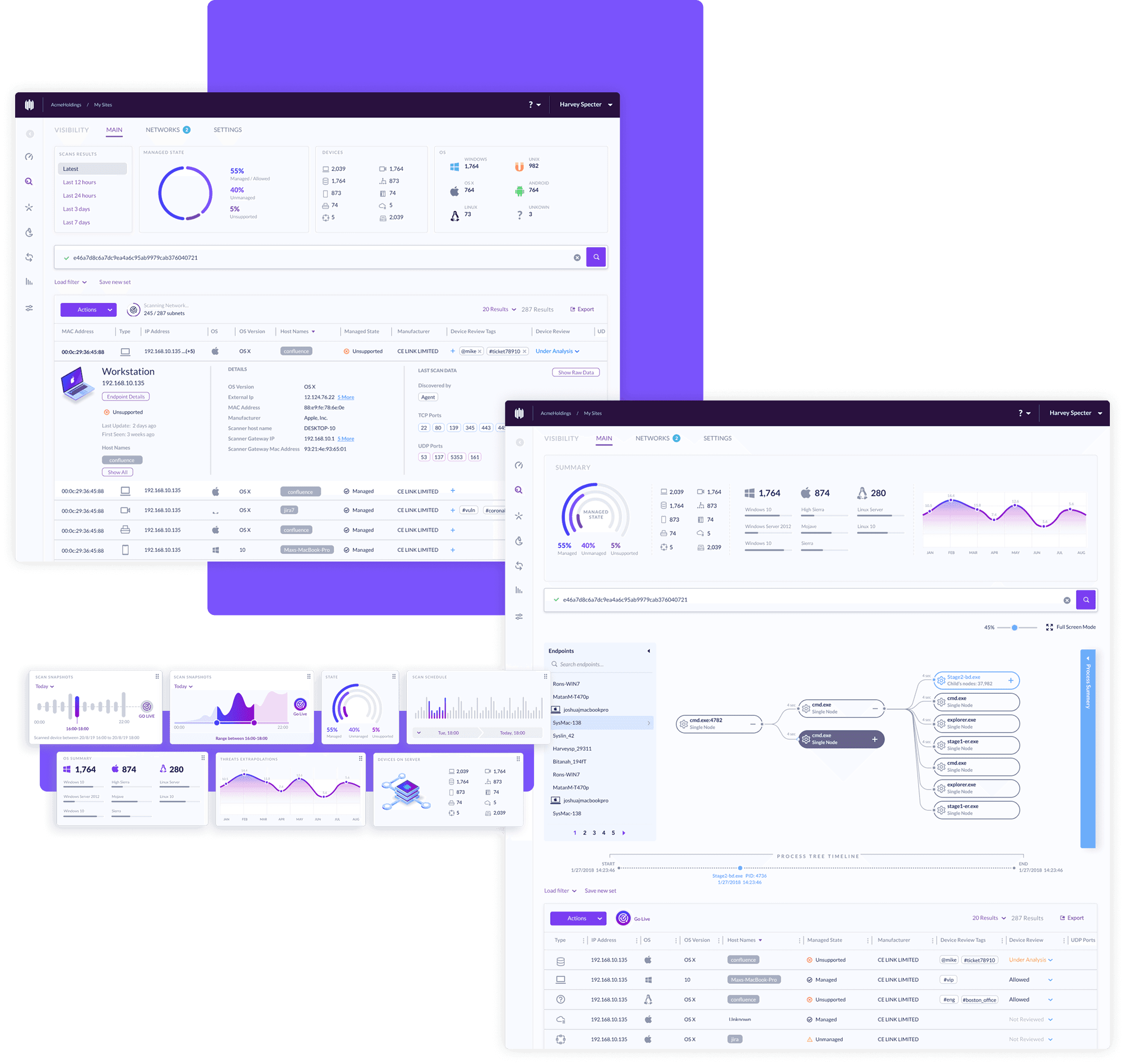
SentinelOne provides autonomous, AI-powered protection across endpoints, cloud workloads, and identity. The platform ingests massive amounts of security telemetry, detects threats in real time, correlates events, and allows analysts to investigate incidents at machine speed.
With customers ranging from global enterprises to mid-sized organizations, the platform must maintain clarity and reliability while supporting advanced investigative capabilities. This environment shaped every design decision we made.
My Role
I worked as part of a cross-functional product & UX team, collaborating closely with PMs, engineers, and security researchers. My work focused on designing core product experiences, from dashboards and incident workflows to cloud-security modules, while helping refine SentinelOne’s unified design system across the platform.
Key User Personas
CISO - Chief Information Security Officer
An executive decision-maker responsible for the organisation’s risk posture.
Needs: High-level visibility, trends, risk indicators, and accessible summaries.
Design focus: Clear dashboards, easy drill-downs, and consistent metric presentation.
SOC Analyst - Security Operations Center Analyst
Cybersecurity users operate under pressure, dealing with complex data, real-time alerts, and high-stakes decisions. Our challenge was to create an interface that delivered depth and power without overwhelming users, while maintaining clarity, speed, and trust across the entire platform.
Responsible for cloud workloads, misconfigurations, and identity-related risks.
Needs: Unified visibility across multiple cloud providers and clear remediation paths.
Design focus: Cloud posture views, resource maps, contextual insights, system consistency.


One of the biggest challenges in redesigning the SentinelOne platform was managing time, the most critical resource for SOC analysts and security teams.
During early research with our Design Partner customers, we learned that a major UX overhaul could actually slow users down by disrupting familiar, muscle-memory workflows.
This insight shaped our approach.
Even as we modernized the interface and improved clarity, hierarchy, and consistency, we intentionally kept the five core actions and navigation patterns in the exact same locations. Preserving these high-frequency interactions ensured that the new UI felt faster and more intuitive, without forcing users to relearn their daily workflows during active security operations.
The result was a cleaner, more scalable, and visually modern interface that still respected the way analysts worked.
This redesign reinforced an important lesson:
good UX is not about changing everything, it’s about changing what helps, and protecting what users rely on.
Old UI
New UI
Engaging primary color
Tabs over endless scroll
New sidebar and navigation system
Improved UX flows
My Role in the Design Process
I collaborated closely with fellow designers, PMs, and engineers to define the redesign strategy, run user interviews, and map the workflows that were most sensitive to change. I was responsible for translating research insights into actionable design decisions, from restructuring layouts and improving visual hierarchy to refining components in the design system. Throughout the process, I helped balance innovation with continuity, ensuring the new UI felt modern while still protecting the speed and familiarity our users relied on.
Threats Page Redesign
Case Study
Overview
The Forensics Page is a critical tool for cybersecurity analysts to investigate threats. The original design made this task unnecessarily difficult due to an overwhelming amount of data, endless scrolling, and poor layout. My challenge was to redesign the experience to help users find, interpret, and act on threat data more efficiently.
I led the end-to-end UX design process: research analysis, defining the IA, wireframing, prototyping, and delivering final high-fidelity designs. I collaborated closely with a product manager, frontend engineers, and security subject matter experts.
Role: UX designer
Length: 8 months
Stakeholders involved:
PM's, R&D, CS, SE.
End user: SOC
User: CISO
Data: Analytics, design partners, competitors.
Pain points
Through internal feedback and usage analysis, we identified several pain points:
Analysts spent too much time trying to locate relevant information.
The page relied on infinite scroll, making it hard to return to previous sections.
The structure was flat and difficult to scan.
Key threat details were buried or inconsistently placed.
Users couldn't view or compare multiple threats side by side.
These issues slowed down investigations and created cognitive fatigue.
Process Highlights
Information Architecture Redesign
Restructured the page into clear, purposeful sections and introduced anchored navigation to reduce unnecessary scrolling.
Visual Hierarchy Improvements
Elevated key threat indicators and implemented consistent UI patterns to create a cleaner, more scannable layout.
Multi-Threat Support
Designed a panel-based layout that allows analysts to open and compare multiple threat details simultaneously without losing investigative context.
Performance Enhancements
Replaced long, scroll-heavy lists with component-level loading to significantly improve speed, responsiveness, and perceived performance.
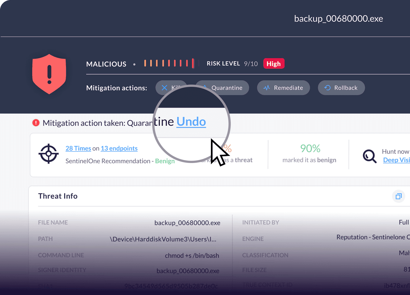
OH NO!
“Undo” action rate
skyed to 130%
in 24h
A Quick Iteration Lesson
After launching our redesigned Forensics Page, we saw a 130% spike in undo actions within a day. Why? We’d moved mitigation actions to a new location, and while our design partners were prepared for it, the broader users weren’t. We quickly reverted the actions back into the main action button dropdown, instantly improving clarity.
It was a great reminder: small changes can have big impacts, and real-user feedback is essential.
Solutions & Outcomes
Average time reduced by 35% from to 60 sec
Page length reduced by 50%
User friendly and organized page layout
Smart and efficient information hierarchy
View and manage multiple events thanks to minimized popups